


Lightweight Progress Circles in React Native

I decided to create my own React Native component to display progress circles. It’s called react-native-progress-circle and you can easily use it in your React Native app. I didn’t use an existing component, because I wanted it to be small and lightweight. It does not depend on react-native-svg or ART, it’s done purely in CSS.
How it works
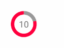
It uses two circles and two half-circles and positions them in a smart way such that they look like the progress circles you see above. (Inspired by react-native-percentage-circle.) It’s done in four steps:
1. Render an outer background circle with the shadow border color.

It’s just a styled View:
<View
  style={[styles.outerCircle, {
    width: radius * 2,
    height: radius * 2,
    borderRadius: radius,
    backgroundColor: shadowColor,
  }]}
/>
2. Render a half-circle and position it according to the percentage
Now we style a View to the size of a rectangle and set the borderRadius property of only two of the four corners. This creates a half-circle.

<View
  style={[styles.outerCircle, {
    width: radius,
    height: radius * 2,
    backgroundColor: color,
    borderRadius: radius,
    borderTopRightRadius: 0,
    borderBottomRightRadius: 0,
    transform: [ { rotate: /* rotate it according to percentage */ } ],
  }]}
/>
3. Render another half-circle and position it according to the percentage
If the percentage is greater than 50%, we need another half-circle and then rotate it. It will overlay the first half-circle to some degree.

4. Render a smaller inner circle with the original background color
Now just put a smaller white circle in the center:

const radiusMinusBorder = this.props.radius - this.props.borderWidth
// ...
<View
  style={[styles.innerCircle, {
    width: radiusMinusBorder * 2,
    height: radiusMinusBorder * 2,
    borderRadius: radiusMinusBorder,
    backgroundColor: this.props.bgColor,
  }]}
>
  {
      this.props.children
  }
</View>
Rotation Issues
Two half-circles are enough to cover all percentages from 0 to 100, however you need to be a bit smart about it:
1. More than 50%:
This is the easy case. The first half-circle will always have a rotation value of 180deg, spanning the right side of the circle.
The second one is computed easily by converting the percent to degrees:
function percentToDegrees(percent) {
  return percent * 3.6
}
2. Less than 50%:
We do the same rotation conversion here, but the problem is that we display the full half-circle instead of only the part on the right circle side.

The solution is use the second half-circle as an overlay for the left side. We render it there (0deg) in the color of the outer circle.

Further Usage with Animated Library
An advantage of only using the built-in CSS features is that we can use the Animated library that provides smooth animations with hardware acceleration. We can then create a simple Countdown Circle with the same concepts.
Hi, I'm Christoph Michel 👋

I'm a , , and .
Currently, I mostly work in software security and do on an independent contractor basis.
I strive for efficiency and therefore track many aspects of my life.