


Charts in React Native with React-Native-SVG and D3.js
Creating charts in React Native requires using external libraries as there is no drawing engine built into it. There is a React Native port of React ART to draw vector graphics, but the documentation is lacking and it looks like it is not maintained. We will use the newer react-native-svg to render SVG. It is really easy to use if you are already familiar with SVG, because react-native-svg provides a JSX wrapper for every SVG component. Its syntax to render a circle and a rectangle looks like this:

import Svg, { Circle, Rect } from 'react-native-svg'

class SvgExample extends Component {
  render () {
    return (
      <Svg height='100' width='100'>
        <Circle
          cx='50'
          cy='50'
          r='45'
          stroke='blue'
          strokeWidth='2.5'
          fill='green' />
        <Rect
          x='15'
          y='15'
          width='70'
          height='70'
          stroke='red'
          strokeWidth='2'
          fill='yellow' />
      </Svg>
    )
  }
}
Correct size of the chart
This works fine for static images with a fixed width and height, but what if you want to dynamically draw a chart that takes all the available space? The Svg component also supports the flexbox layout which you can use in conjunction with the viewBox props to scale your graphics to the available space automatically. For that you define an arbitrary width and height in the viewBox property, which you then use as a base for your computation, and it will be rescaled to the actual available width and height of the Svg component.
<Svg style={{flex: 1, alignSelf: 'stretch'}} viewBox='0 0 1000 1000'>
  <Rect
    x='50'
    y='50'
    width='900'
    height='900' />
</Svg>
This might work out in your case, however, I found this to be insufficient for my purpose as the aspect ratio of your viewBox, the ratio of the width to the height, will most likely not match the aspect ratio of the actual available space, because you simply don’t know it. The result is your width and height will be scaled inpropotional, making the stretching look bad.
 _
Left: Width and height scaling is not proportional.
Right: Width and height uses all available space.
_
_
Left: Width and height scaling is not proportional.
Right: Width and height uses all available space.
_
You can try playing around with the preserveAspectRatio property, but I found it easiest to use React Native View’s onLayout to get the actual width and height of the available space, and simply pass this information to the Svg component. In this post, I described the approach using onLayout to dynamically get the size of a View.
Creating Charts in React Native
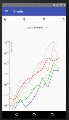
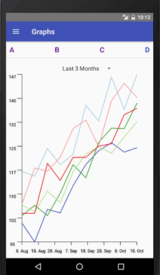
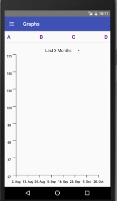
Once you know the width and the height of your component, you can start building the above Line Chart in React Native.
The line chart consists of two axes and an SVG path for each set of data points. The nice thing is we can make use of the component model of React to create a reusable line chart with reusable axis components and lines. We create an Axis component that we simply insert into our Svg JSX, and the Axis’ render function returns some react-native-svg JSX in its own render function.
<Svg width={width} height={height}>
  <Axis
    width={width - 2 * this.padding}
    x={this.padding}
    y={height - this.padding}
    ticks={8}
    startVal={minDate}
    endVal={maxDate}
    scale={xScale} />
  <Axis
    width={height - 2 * this.padding}
    x={this.padding}
    y={height - this.padding}
    ticks={8}
    startVal={minVal}
    endVal={maxVal}
    scale={yScale}
    vertical />
  {data.map(
     (pathD, i) => <Path
                     fill='none'
                     stroke={colors[i % colors.length]}
                     strokeWidth='5'
                     d={pathD}
                     key={i} />
   )}
</Svg>
Convert data points to coordinates
First, we need a way to convert the data points to SVG coordinates. Here is where d3.js comes into play with its d3-scale classes. A scale takes as input values from a domain interval, the values/dates on the axes, and maps it (in our case linearly) to a range interval, the width or height of the Svg component. For the y-Axis we will use d3.scaleLinear(), for the x-Axis we use a linear date scale, d3.scaleTime().
If the data points for the lines are stored as (date, value) pairs in dataPoints, we can write:
import * as d3scale from 'd3-scale'
createScales = (dataPoints, width, height, padding) => {
    let xScale = d3scale.scaleTime().domain([padding, width - padding])
    // y grows to the bottom in SVG, but our y axis to the top
    let yScale = d3scale.scaleLinear().domain([height - padding, padding])
    let dateTimes = dataPoints.map(pair => pair[0].getTime())
    let values = dataPoints.map(pair => pair[1])
    xScale.range(new Date(Math.min(...dateTimes)),
                    new Date(Math.max(...dateTimes)))
    yScale.range(Math.min(...values), Math.max(...values))
    return {xScale, yScale}
}
Creating the Axes
Now we use these scales to build the axes and the lines. The axis will be a simple SVG line element with a marker (a smaller perpendicular SVG line) after every x points, calculated from the axis’ ticks property. At the ticks we also create an SVG Text element transforming the position into the tick value using the previously defined d3.js scale. The skeleton for rendering a horizontal axis will be:
<G fill='none'>
    <Line
      stroke='#000'
      strokeWidth='3'
      x1={x}
      x2={endX}
      y1={y}
      y2={endY} />
    {tickPoints.map(
       pos => <Line
                key={pos}
                stroke='#000'
                strokeWidth='3'
                x1={pos}
                y1={y}
                x2={pos}
                y2={y + TICKSIZE} />
     )}
    {tickPoints.map(
       pos => <Text
                key={pos}
                fill='#000'
                stroke='#000'
                fontSize='30'
                textAnchor='middle'
                x={pos}
                y={y + 2 * TICKSIZE}>
                {typeof startVal === 'number' ? Math.round(scale(pos), 2)
                                            :scale(pos).toLocaleDateString()}
              </Text>
     )}
</G>
The actual code also takes into account vertical axes and computes the tickPoints. It’s available here.
Creating the Lines
We will use an SVG path element to represent the individual lines. The coordinates are specified within the path’s d attribute, however it has its own language and set of instructions that we don’t want to deal with. Instead, we make use of d3-shape’s line function transforming the data points into the corresponding d attribute. Therefore, we must provide line with the SVG coordinates, so we first apply the inverse function of our xScale and yScale to the pairs. The idea is as follows:
import * as d3shape from 'd3-shape'
render() {
    let lineGenerator = d3shape.line()
      .x(d => xScale.invert(d[0]))
      .y(d => yScale.invert(d[1]))
    let data = []
    // lines is an array of arrays of pairs
    // where an array of pairs represents a line
    lines.forEach(lineDataPoints => {
      data.push(lineGenerator(lineDataPoints))
    })
    return (
        <Svg ...>
            <Axis ... />
            <Axis ... />
            {data.map(
                (pathD, i) => <Path
                                fill='none'
                                stroke={colors[i % colors.length]}
                                strokeWidth='5'
                                d={pathD}
                                key={i}
                                />
            )}
        </Svg>
    )
}
Conclusion
If you combine all these steps, you end up with reusable Charts in React Native, and in general you can build the same profound D3.js visualizations with react-native-svg that you can build in standard web development.
Hi, I'm Christoph Michel 👋

I'm a , , and .
Currently, I mostly work in software security and do on an independent contractor basis.
I strive for efficiency and therefore track many aspects of my life.