


Styling DatePickerAndroid in React Native
The standard style of the DatePickerAndroid Component is a teal background which might not blend with the color scheme you’re using in your React Native app. I’ll show you how to style DatePickerAndroid to match your theme.
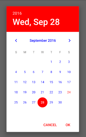
DatePickerAndroid is an API for the native DatePicker Android module and thus cannot be directly styled through JS props like real React Native components. However, you can style the native android modules by changing the styles.xml in your android folder. It is located at “android/app/src/main/res/values/styles.xml” relative to your react-native project. To get a red background for the DatePicker, you edit the contents of styles.xml as follows:
<resources>

    <!-- Base application theme. -->
    <style name="AppTheme" parent="Theme.AppCompat.Light.NoActionBar">
        <!-- Customize your theme here. -->
        <item name="android:datePickerDialogTheme">@style/Dialog.Theme</item>
    </style>

	<style name="Dialog.Theme" parent="Theme.AppCompat.Light.Dialog">
	    <item name="colorAccent">#FF0000</item>
	    <item name="android:textColorPrimary">#0000FF</item>
 	</style>
</resources>
The app has to recompile for the styles to be applied, so run react-native run-android again.
Hi, I'm Christoph Michel 👋

I'm a , , and .
Currently, I mostly work in software security and do on an independent contractor basis.
I strive for efficiency and therefore track many aspects of my life.