Blog redesign with Gatsby and TailwindCSS
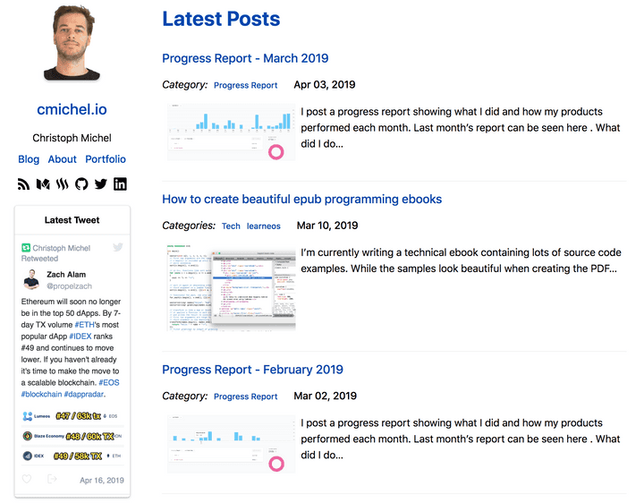
This blog exists for over 3 years now and I felt it was time to do another redesign. Since its inception the blog went through four redesigns already:
- February 2016: Started the blog on WordPress.
- 07 November 2016: Moving from Wordpress to phenomic, a static page generator. I redesigned the blog here to the minimalist white / blue design which I’ve been using until today.
- 28 November 2017: Port from phenomic to GatsbyJS v1, a better static site generator. I’m not sure why I made the move to the new technology. Probably because
gatsbycame out as the clear and more future-proof winner. - 08 October 2018: Update to
gatsby v2: Just a technical update, no design or functionality changes. - Today: Still running the same technology (minor changes), but a major design change as I got bored with the old one.
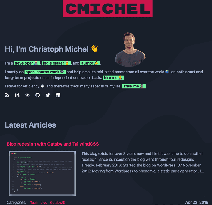 New dark mode with red & green colors
Design decisions
- Dark mode using similar colors as my VS Code programming theme One Dark Space Gray.
- Removed a strict
/aboutand/portfoliopage and instead show a short bio on the main/website. Users can click on the green buttons for further information on a specific topic about me, which then makes the specific section visible. I prefer this approach as it doesn’t immediately overload the user with too much text and information about me, while still allowing the user to pick topics they are interested in. - Created an interesting Metaballs effect as the background using my metaballs-js package I wrote in WebGL. Initially, the metaballs were in a lowly saturated red but it was too distracting, so I just made everything black and the actual metaballs barely visible. It also has a nice mouse-over effect where one metaball keeps following the cursor.
Technical updates
- My previous blog used
glamorous, a CSS-in-JS solution, to style elements. I never was a fan, gave it a try because it was hyped, and still don’t like it. I removed it again. I prefer highly-customizable functional CSS libraries like TailwindCSS. The development is so much faster, more enjoyable, more maintainable and leads to a more consistent design. It’s like writing inline styles but in a clean way. 😃 It’s also really tiny when combining it with purgecss as we will see later. Read more about it in this excellent post and give it a try. - I now make full use of the power of gatsby. Everything is pre-processed by some plugin and then queried by GraphQL. 😅 Using gatsby-image for all images now transforms them into the correct sizes. Meaning, I don’t have to do manual image manipulation anymore or pay for a service like cloudinary. The biggest advantage is for the user and SEO as less KBs need to be downloaded.
- There’s a funny
Stalk Mesection showing real-time stats about me, like what music I’m listening to, what and how many hours I worked on in the past week. The way it works is by deploying my blog to Netlify and making use of Netlify functions, essentially AWS Lambda functions. Upon hitting my Netlify stats function API endpoint, it hits several other API endpoints to collect and return the data (Last.fm scrobbling Spotify, Clockify, and Makerlog). And it’s all free for my usage tier!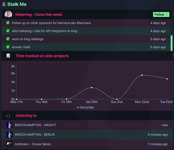 Stalk Me section providing real-time stats
Performance
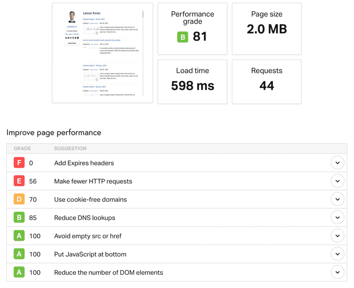
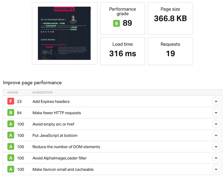
Running a pingdom.tools web performance test on the old and new websites yields these results:
The new website is drastically smaller (from 2MB down to 366KB). This is mostly due to converting the featured images to thumbnails (and webp) instead of showing the full-sized ones. The amount of request roundtrips is also reduced. I’m shipping 245KB of JavaScript (vs 161KB) and only 26KB of HTML + inlined CSS (vs 21.6KB + 12.5KB). Using Tailwind as a CSS framework with purgecss I ended up with 11KB of CSS which is even less than my previous solution with no CSS framework and glamor.
All in all, I’m really happy with its performance & SEO, the design, and the development & authoring experience. This should keep from doing another redesign 💅 for at least another year before I get bored again. 😅
If you’d like to see how a specific feature works in more detail, my blog is open-source.
Update
Using WebGL seems to lead to an extremely bad Google Pagespeed Insights Score because they seem to think a site is “ready” only when the CPU is idle …
Their new web.dev tool still can’t even handle WebGL and just crashes with Error: Backend Error on websites using WebGL. 🤷♂️
If I remove the metaballs WebGL package my score goes from 39 to 100. 🤣
I refuse to bow to these broken arbitrary metrics and observe if there are any actual performance problems on mobile devices instead.
